User Task Flow Diagram: E-Commerce Purchase Journey
This task flow diagram visualizes the sequence of actions a customer takes to find, select, and purchase a product on an e-commerce website. Grounded in a realistic user scenario, the flow chart maps key tasks, decision points, and dependencies—such as browsing, searching, product selection, and checkout—to clarify required site functionality and identify potential friction within the purchasing journey.
User Scenario: Online Shopping Experience Narrative
This user scenario describes a realistic e-commerce shopping experience from the customer’s perspective, outlining their goals, motivations, and actions as they browse, select, and purchase a product online. Written in a story-like format, the scenario focuses on real user behaviors and contextual factors to highlight user requirements, surface potential usability issues, and provide a clear foundation for the corresponding task flow diagram.
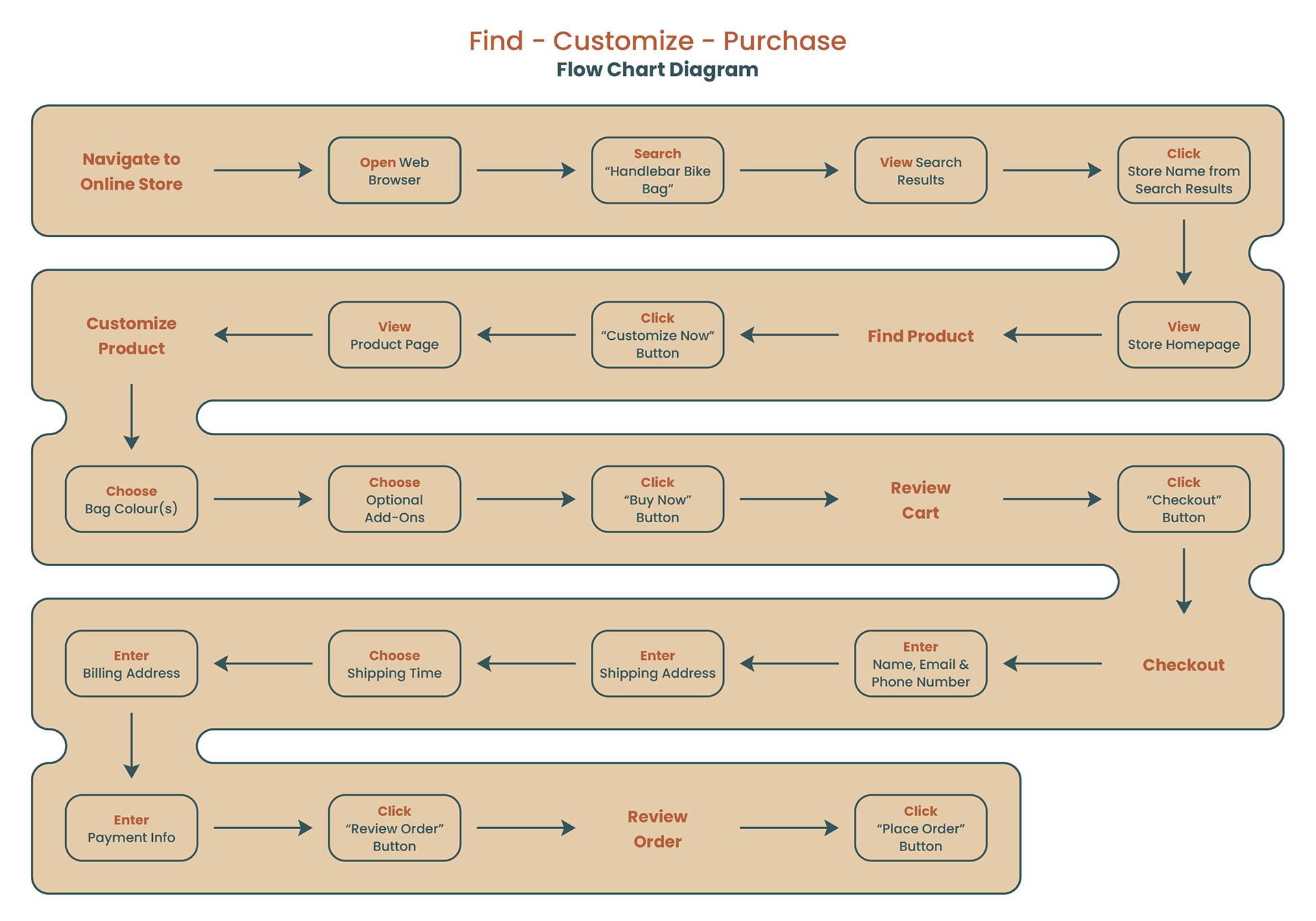
Paul is a dedicated cyclist in the Ottawa area and loves to get out for a ride whenever possible. Since cycling is his main form of transportation, Paul doesn’t mind spending money on gear, accessories or cosmetic upgrades. Recently, he has been thinking about purchasing a handlebar bag to hold the various gear he takes with him on every ride (inner tubes, pump & multitool). Paul decides to shop around at his local bike stores first to see what’s available locally to him. Unfortunately, none of the bags he finds interest him and he returns home empty handed.
Not giving up, he boots up his computer and in his web browser, searches for “Handlebar Bike Bag”. After clicking through a few links with no luck, Paul clicks on a link that takes him to a homepage that has one “Customize Now” button overlaying a vibrant image of a cyclist with the exact bag he is interested in. Excitedly, he clicks the button and is brought to a product page where he then sees the various ways in which he can customize a bag. Paul picks out the various colours he’d like for the main compartment, side panels, and interior fabric. He also decides to pay a little extra for a few additional add-ons. Satisfied with his customized bag, he clicks the “Buy Now” button that is right below the last menu item.
The next page he sees gives him one last opportunity to make any changes to his bag before he checks out. Confidently, Paul clicks the “Checkout” button as he is very happy with his bag. On the checkout page, Paul fills out the basic info (name, email, phone number), shipping address, shipping time, billing address (same as shipping), and payment information. He wants to give everything one last look over before buying and conveniently there is already a button on the page that allows him to “Review Order”. After clicking he confirms with himself that everything has been filled out correctly and clicks one last button: “Place Order”.
All Paul has to do now is wait for his bag.
Prototype Fidelity Decision & Stakeholder Memo
This deliverable outlines the selected level of fidelity for an e-commerce prototype and the rationale behind that choice, communicated through a stakeholder-facing memo. The memo defines the prototype’s objective and focus, details the types of content to be included, and explains the level of detail required for each content type to ensure the prototype is appropriate for the current stage of design and effective for review by internal teams and business stakeholders.
Internal Memo: Prototype Design Characteristics & Dimensions
This internal memo outlines the selected dimensions for key prototype design characteristics—including audience, stage, speed, longevity, expression, style, and medium—and explains the rationale behind each choice. The memo is intended to align the internal team on how the prototype should be built and used, ensuring consistency with the chosen level of fidelity and supporting efficient collaboration throughout the design process.
High-Priority Screen Prototype for E-Commerce Transaction Flow
This prototype presents the highest-priority screens of an e-commerce website, focusing on the core transaction flow from homepage discovery through account interaction and item purchase. Built from prior user scenarios, task flows, and design criteria, the prototype explores layout variations, input placement, and purchasing interactions to support early usability testing and validate key design decisions.
Homepage
The homepage for this ecommerce site includes a header, main body and a footer. Like most (if not all) sites, the design/format of the header and footer remains consistent across all pages.
For the header (starting from the left), there is a logo/site name and five menu items. When any of these elements are clicked, they will redirect the customer to their respective page. Clicking the logo/site name element will always redirect customers back to the homepage unless they’re already there.
The main body of the homepage will include a page wide banner image (ideally of a bike with a custom handlebar bike bag) with the relevant text and button overlaid. It’s important that a good image is used in order to catch the eye of any potential customers which in turn, would get them to click the “Design Yours Today!” button.
In order to add more content to the homepage body, there is a “Shop Bags” section below the banner image. This section would be a perfect visual addition to the homepage since it would allow the customer to see what various handlebar bike bags look like. Furthermore, customers can click on either the image or the button for each respective bag in order to proceed to a product page for said item. Subtly, the prices of these bags would be more than the starting price to customize a bag which ideally would lead to users customizing a bag on their own instead of buying one pre-customized.
Finally, the footer is super generic and only includes the most basic ecommerce site information.

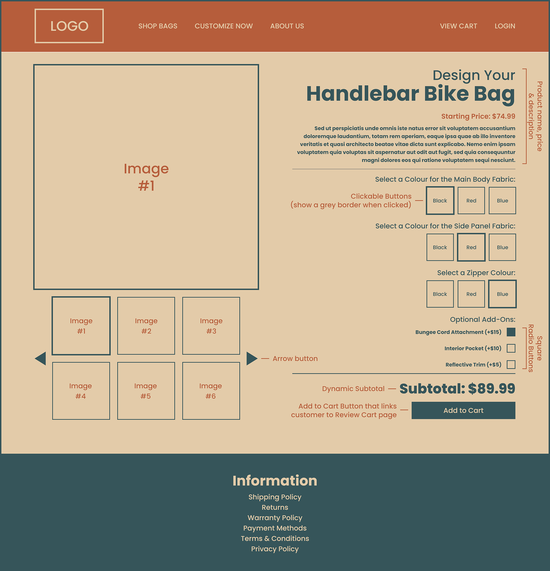
Product Page
This is the most important page for boosting the overall customer experience.
On the left side (as seen on the Product Page), there is a large image that by default, shows the first image out of the six smaller images. While only six small images are visible, more can be added and customers can click on the arrows to rotate through the small images. There is also a subtle outline around the selected small image so customers don’t have trouble confusing what large image is currently being shown.
Moving to the right side, there is a title, starting price and description for the product all of which is pretty generic but important to include nonetheless.
There are three customization options: Main Body Fabric, Side Panel Fabric and Zipper Colour, and customers can choose from three colour options for each: Black, Red and Blue. A border will appear around each colour that is selected although only one colour can be selected per customization option.
For the “Optional Add-Ons”, customers can select the boxes and the change in price of the bag will be updated as seen in the “Subtotal”. They can select and unselect the boxes simply by clicking on them until they’re happy with the final product and/or price of the item. It’s worth mentioning that there will be images that showcase the three add-ons in the photo gallery on the left side of the page.
The “Add to Cart” button can only be clicked after a colour has been selected for each customization option, otherwise an error message will display.
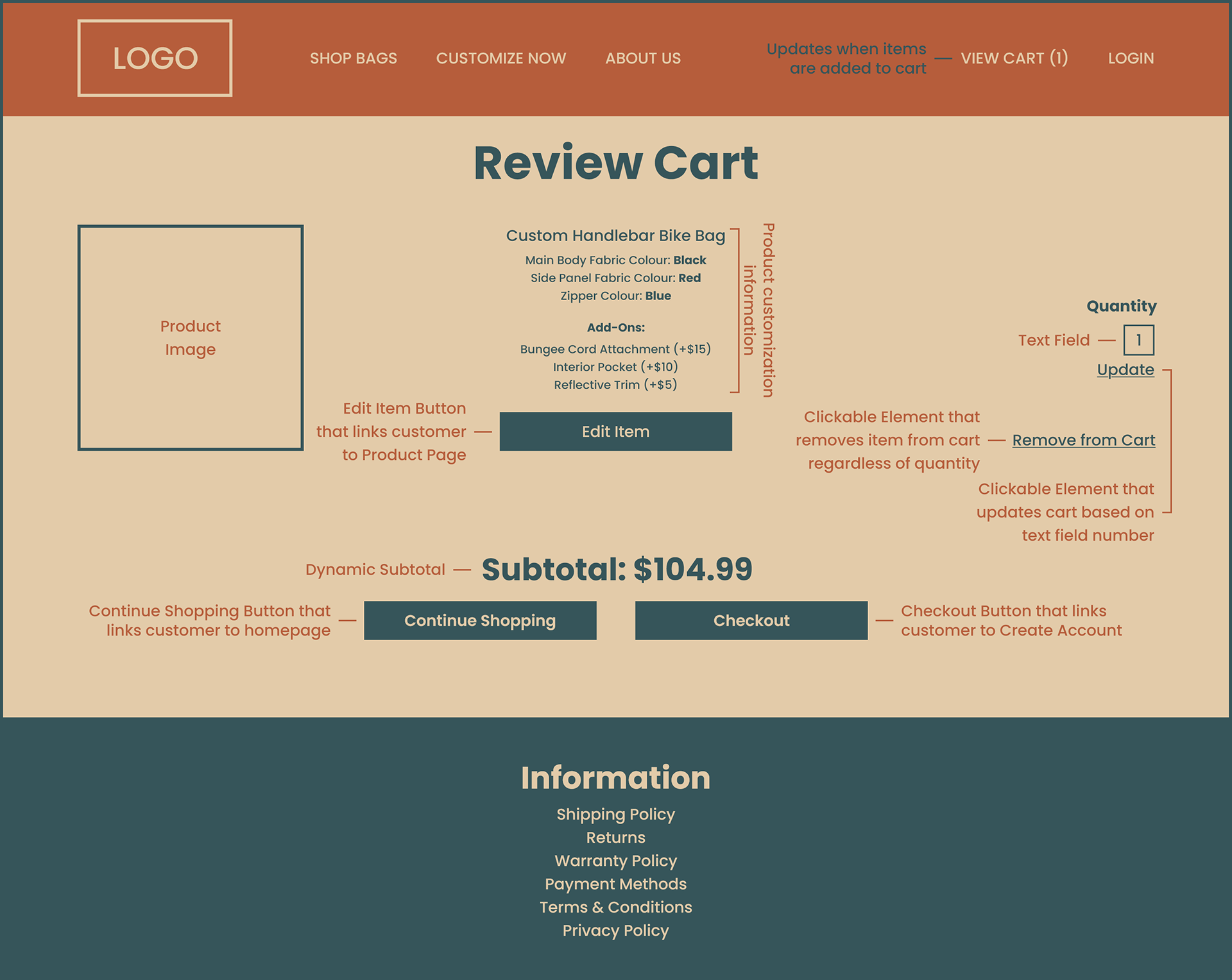
Review Cart
The purpose of this page is to show the customer what item(s) have been added to their cart. For example, this page shows that a customer has added a custom handlebar bike bag to their cart plus the various selections and add-ons they’ve picked. A photo can even be shown to the left of each item in the cart so customers can visually have confirmation that they’re buying the right thing before proceeding to checkout.
The customer can adjust the quantity of items by updating the “Quantity” text field from one to any number they desire (within reason) and then clicking “Update”. If that number is set to zero, the item will be removed from the cart. However, customers can also click on “Remove from Cart” to achieve this as well.
If a customer wants to edit an item in their cart, they can click the “Edit Item” button (below the item in question) and return to the Product Page. After returning, the “Add to Cart” button on the will be replaced by an “Update Cart” button. When clicked, it’ll take the customer back to the Review Cart page with the changes to their item now reflected.
In the event that a customer isn’t ready to checkout and would like to continue shopping, they can click the “Continue Shopping” button. Otherwise, they can click the “Checkout” button.
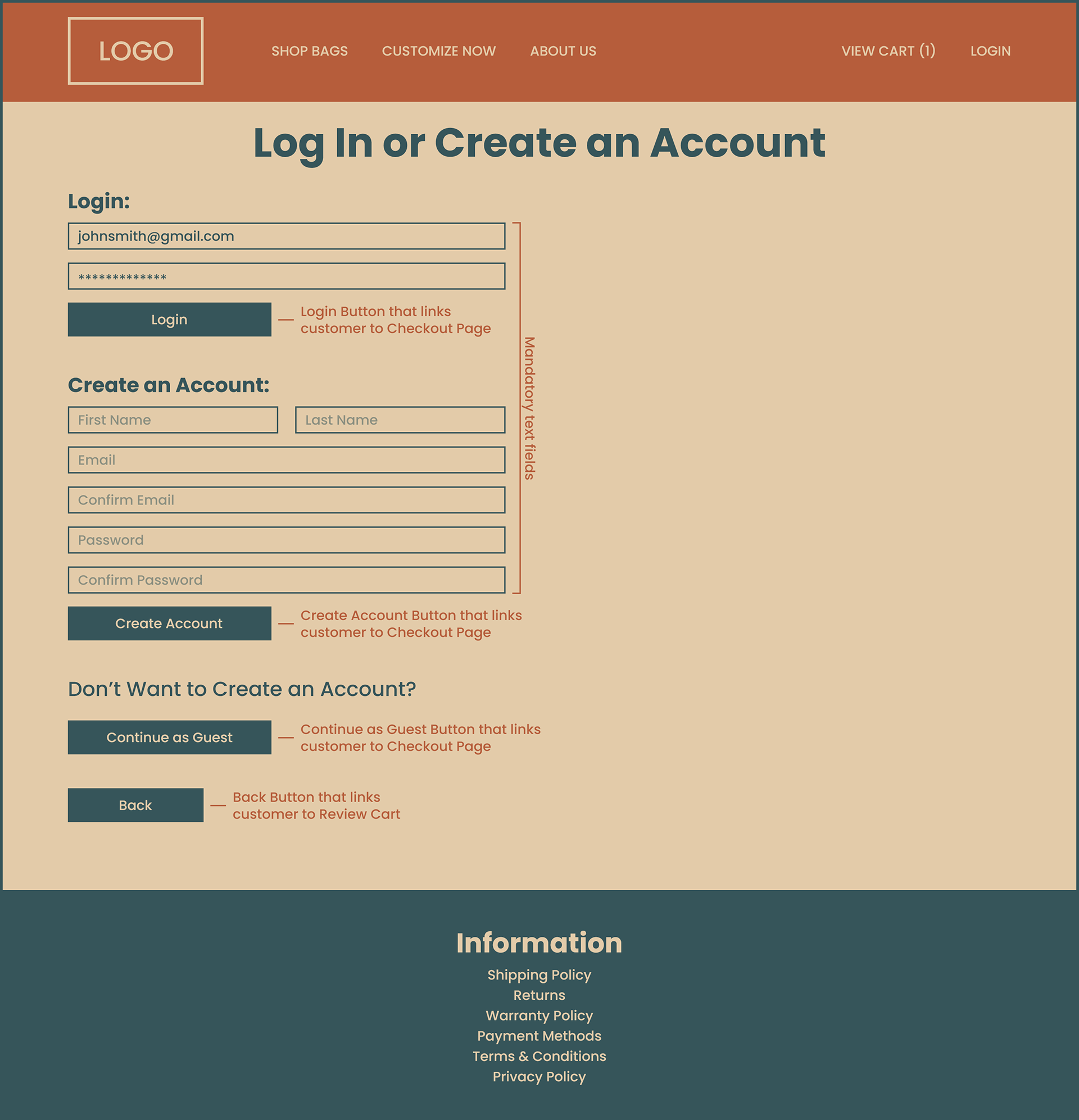
Customer Account
A customer can get to this page either by clicking “Login” located in the top right corner at any point during their shopping experience up until the moment they click the “Checkout” button on the Review Cart page in which they’ll be directed to this page regardless.
While this page encourages customers to log in or create an account, they can also proceed as a guest by clicking the “Continue as Guest” button.
In the event that a customer forgets to fill in a text relevant field and clicks the “Login” or “Create Account” button, an error message will display and the appropriate text field that was missed will be outlined in red.
Lastly, if the customer would like to return to the previous page, there is a “Back” button available.
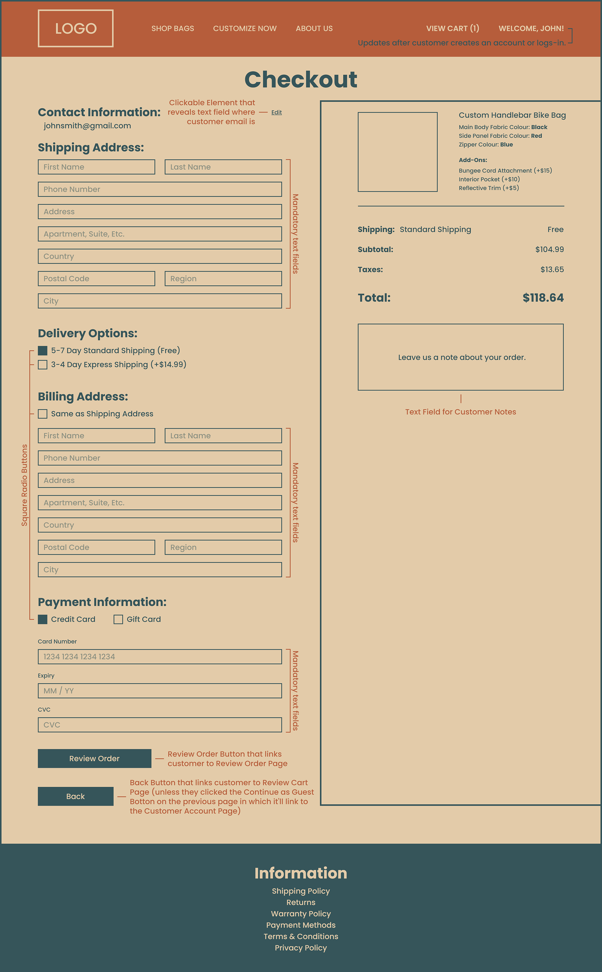
Checkout Page
While this is a fairly generic ecommerce checkout page, there are a few details that could make the checkout process feel smoother for the customer.
If the customer either logged in or created an account on the previous page, they would have entered their email and therefore it is automatically filled in on this page. However, if the customer clicked the “Continue as Guest” button on the previous page, they’d have to fill out the email field themselves.
There are two delivery options available on this checkout page and the customer will have the ability to select which option they prefer. Free Shipping is selected by default although, if the customer wanted to pay more for shipping, they could select Express Shipping which would update the right side of the page (shipping, subtotal, taxes and total).
In the event that customers have the same shipping and billing address, they can select the “Same as Shipping Address” box which will collapse all the billing information (since it will remain the same as the shipping). This detail saves the customer from having to retype the same information and will speed up the checkout process.
The credit card box is selected by default for “Payment Information” although if the customer wishes to partially or fully pay via gift card, there is a box they can select.
If the customer logged in or created an account on the previous Customer Account page, clicking the “Back” button will return them to the Review Cart page whereas if the customer clicked the “Continue as Guest” button, they’ll return to the Customer Account page.
In the event that a customer forgets to fill in a text field and clicks the “Review Order” button, an error message will display and the text field that was missed will be outlined in red.
Lastly, on the right side of the page, customers have the ability to type in any notes they may have regarding their order before continuing to the next page.
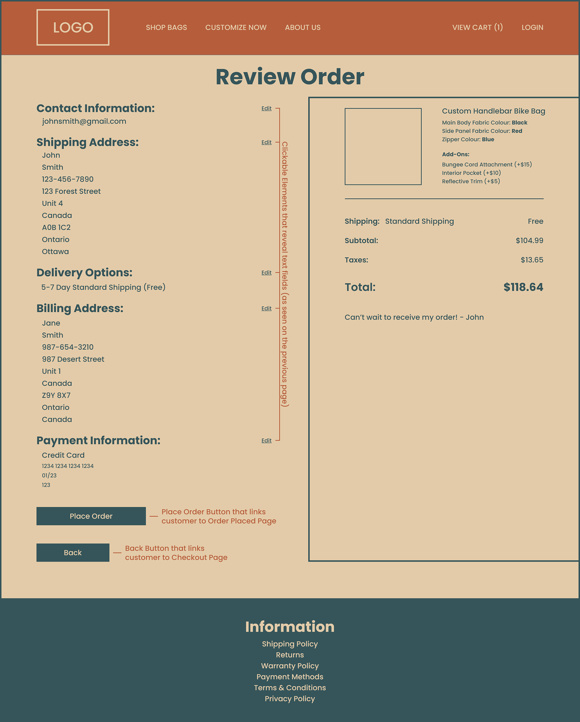
Review Order
This page provides a last minute overview for the customer before they submit their order.
The text boxes from the previous page have been removed in order to display the contact information, shipping address, delivery options, billing address and payment information as clearly as possible. In the event that the customer needs to correct any of the preceding information, there are five “Edit” buttons so the corresponding data can be changed and updated before placing the order.
The right hand side of the page also displays all the relevant cart information as seen on the previous page including the customer note (if they choose to leave one).
Customers can also click the “Back” button to return to the previous page to make changes whether that be because they didn’t see the “Edit” buttons or because they have multiple changes they need to make.
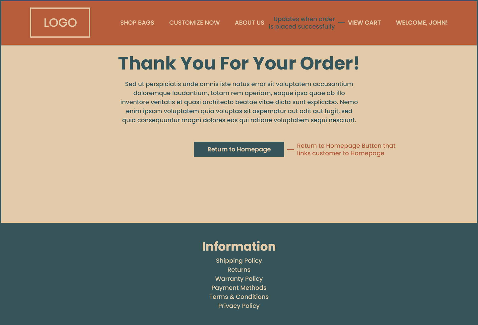
Order Confirmation
The final page a customer should see when making an online purchase should be in the form of a confirmation page that informs them that their order has been placed successfully.
As seen on this page, the text “Thank You For Your Order” followed by a Lorem Ipsum paragraph serves as confirmation for a successful order.
There is also a subtle detail on this screen that may or may not be seen by customers but it’s important regardless. On the previous page Review Order in the top right corner there is one item in the customers cart seen as “View Cart (1)”. After placing an order, the cart updates to show “View Cart”, signifying that there are no longer any items in the cart and that the order has been placed successfully.
Due to being the smallest page on the site, it has been appropriately sized to the industry-standard resolution of 1920x1080 in order to perfectly fill the screen without the need to scroll.
From here, the customer can either leave the site completely or return to the homepage to start the process over by clicking the button labeled “Return to Homepage”.
Mobile E-Commerce Prototype: High-Priority Screens
This mobile prototype focuses on the highest-priority screens of an e-commerce experience, including the home page, item detail page, user account, and checkout flow. Designed specifically for mobile use—not as a scaled-down web experience—the prototype prioritizes essential content, clear purchasing actions, and efficient navigation within limited screen real estate, making it suitable for early-stage usability testing and validation.
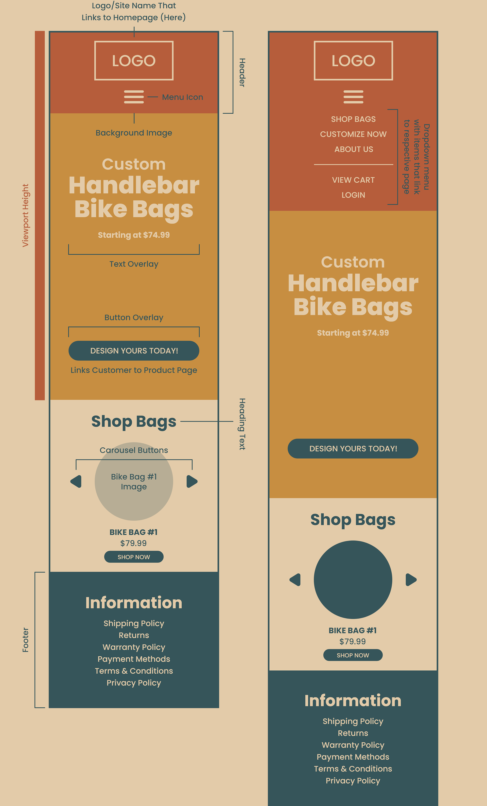
Homepage
A viewport size of (430x932) was used for all pages of this design.
In order to be as efficient as possible with the limited space given at a mobile screen size, the header contains only a site logo and menu icon. When the menu icon is clicked by a customer, a dropdown menu will appear and show the following: Shop Bags, Customize Now, About Us, View Cart and Login. When any of these elements are clicked, they will redirect the customer to their respective page. Clicking the logo/site name element will always redirect customers back to the homepage unless they’re already there. The customer can then either click the menu icon again to close the dropdown menu or continue to scroll through the homepage. This dynamic header design frees up a significant amount of space that would be otherwise dedicated to a static list of menu items.
With the main focus of the eCommerce site being “Custom Handlebar Bike Bags”, it is important in combination with the header, the Custom Handlebar Bike Bags graphic fills the entire viewport of a customer's screen. Space has intentionally been left between the text and button overlay to leave room for an eye-catching and relevant image.
Scrolling further down on the homepage will lead to “Shop Bags” where curious customers can scroll through a 1x1 carousel of bike bags. While these products wouldn't be customizable, they’d be a great visual aid that can show off the construction, design, features and colours that the bike bags come in.
Finally, the footer is super generic and only includes the most basic ecommerce site information.
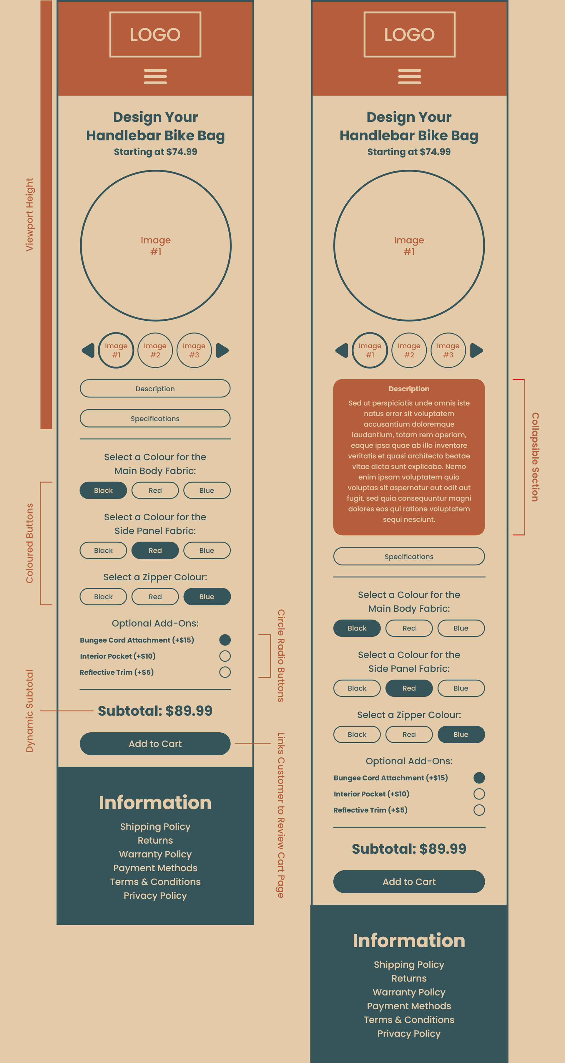
Product Page
Customizing a bike bag should be an effortless process free of constant scrolling unnecessary content and was the motivation behind the design of this product page.
The large image can be utilized to show a bike bag in more detail which can help a customer approach the customization process further down. Below the large image is a 1x3 carousel of smaller images, when one of these images is pressed, it populates the large image above.
Instead of displaying a full description and specification sheet of the bike bags (which would only lead to customers having to scroll further down the page to customize a bag), there are two buttons: “Description” and “Specifications”. When individually pressed, dropdown text for the relevant button appears (which can then be minimized when pressed again). While being able to read the description and specifications of a bike bag can be useful for customers, it’s more important that they scroll as little as possible to get to the customization process.
There are three customization options: Main Body Fabric, Side Panel Fabric and Zipper Colour, and customers can choose from three colour options for each: Black, Red and Blue. A border will appear around each colour that is selected although only one colour can be selected per customization option.
For the “Optional Add-Ons”, customers can select the circle radio buttons and the price of the bag will be updated as seen in the “Subtotal”. They can select and unselect the buttons simply by clicking on them until they’re happy with the final product and/or price of the bike bag. It’s worth mentioning that there will be images that showcase the three add-ons in the image carousel at the top of the page.
The “Add to Cart” button can only be clicked after a colour has been selected for each customization option, otherwise an error message will display.
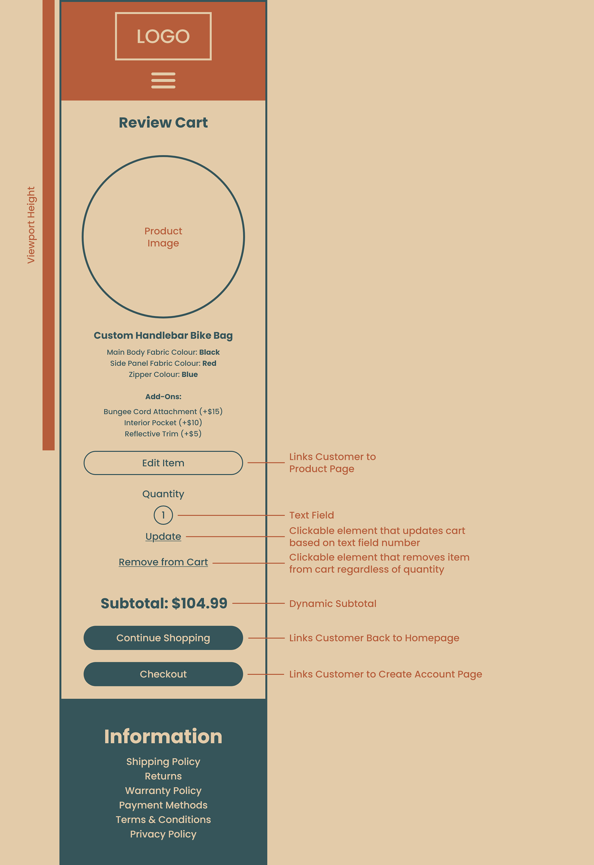
Review Cart
The purpose of this page is to show the customer what item(s) have been added to their cart. For example, this page shows that a customer has added a custom handlebar bike bag to their cart plus the various selections and add-ons they’ve picked. A photo can even be shown above each item in the cart so customers can visually confirm that they’re buying the right thing before proceeding to checkout.
If a customer wants to edit an item in their cart, they can click the “Edit Item” button (below the item in question) and return to the Product Page. After returning, the “Add to Cart” button will be replaced by an “Update Cart” button. When clicked, it’ll take the customer back to the Review Cart page with the changes to their item now reflected (as well as the subtotal if applicable).
The customer can also adjust the quantity of items in their cart by updating the “Quantity” text field from one to any number they desire (within reason) and then clicking “Update”. If that number is set to zero, the item will be removed from the cart. However, customers can also click “Remove from Cart” to achieve this as well.
In the event that a customer isn’t ready to checkout and would like to continue shopping, they can click the “Continue Shopping” button. Otherwise, they can click the “Checkout” button.
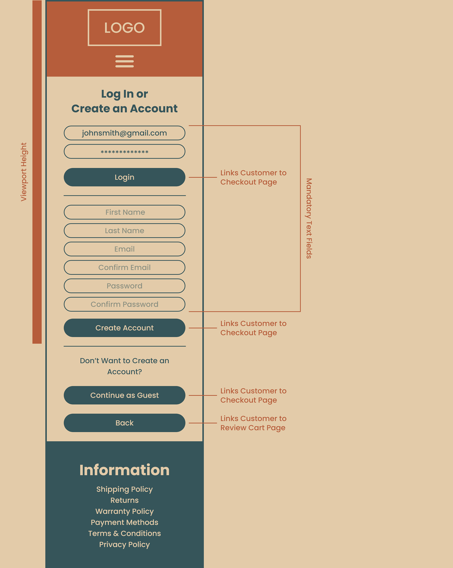
Customer Account
At any point during their shopping experience up until the moment they click the “Checkout” button on the Review Cart page, a customer can login by clicking the menu icon located on the header, then clicking “Login” located at the bottom of the dropdown menu. Otherwise, they’ll be directed to this page when they click the “Checkout” button on the Review Cart page (unless they’ve previously signed in or created an account).
While this page encourages customers to log in or create an account, they can also proceed as a guest by clicking the “Continue as Guest” button.
In the event that a customer forgets to fill in a relevant text field and clicks the “Login” or “Create Account” button, an error message will display and the appropriate text field that was missed will be outlined in red.
Lastly, if the customer would like to return to the previous page, there is a “Back” button available.
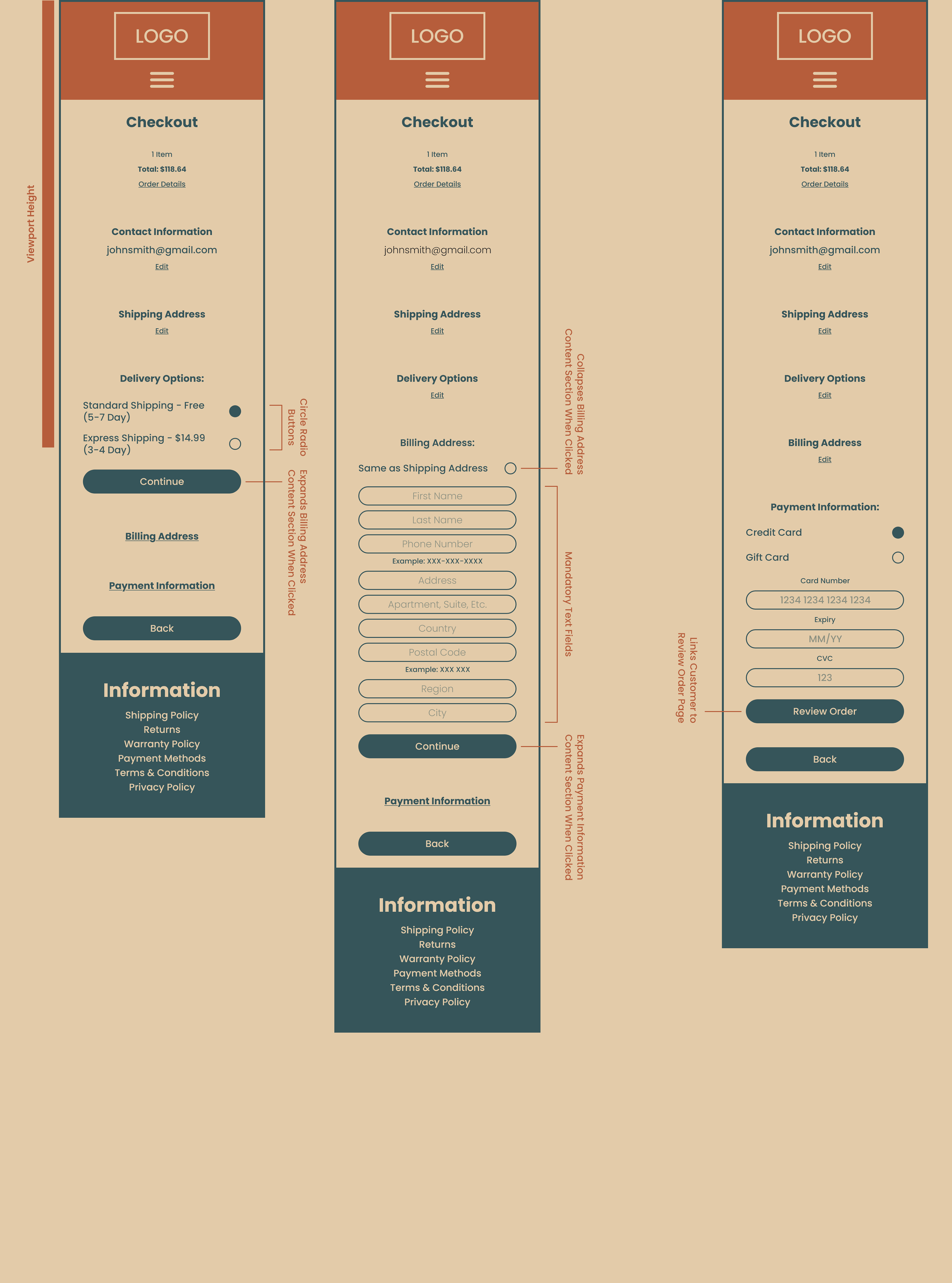
Checkout Page
While this is a fairly generic ecommerce checkout page, there are a few details that could make the checkout process feel smoother for the customer.
When pressing the menu icon on the header, the dropdown menu has been updated to show the number of items in the customer’s cart as well as confirmation that they’ve signed in.
Ideally customers should thoroughly review their cart on the Review Cart page, however, if they’d like to see their order details, they can click “Order Details”. By default, this content section would be collapsed but when clicked, it would show the item(s) in their cart as well as the relevant cost information such as shipping, subtotal, taxes, final total and a text field for order notes (optional). Clicking “Hide Order Details” would then collapse this content section. It’s important that this information is accessible when needed, but having it out of the way frees up space on the page for the customer to enter their checkout information.
If the customer either logged in or created an account on the previous page, they would have entered their email and therefore it is automatically filled in on this page under “Contact Information”. However, if the customer clicked the “Continue as Guest” button on the previous page, they’ll have to fill out the email field manually.
In order to complete the checkout process, the customer will have to enter their shipping address, billing address, payment information and also select a delivery option. With the exception of the shipping address, each of these sections will be collapsed by default. When the customer completely fills out their shipping information and clicks the “Continue” button, this section will collapse and the delivery options section will be shown. This process will continue until the customer completely fills out their payment information then they can click the “Review Order” button to proceed to the Review Order page. At any point in this process, the customer can click “Edit” under an corresponding section and make a change to an information entered.
There are two delivery options available on this checkout page and the customer will have the ability to select which option they prefer. Free Shipping is selected by default although, if the customer wanted to pay more for shipping, they could select Express Shipping which would update in the collapsed “Order Details” content section.
In the event that customers have the same shipping and billing address, they can select the “Same as Shipping Address” box which will collapse all the billing information (since it will remain the same as the shipping). This detail saves the customer from having to retype the same information and will speed up the checkout process.
The credit card box is selected by default for “Payment Information” although if the customer wishes to partially or fully pay via gift card, there is a box they can select.
In the event that a customer forgets to fill in a text field and clicks the “Review Order” button, an error message will display and the text field that was missed will be outlined in red.
Lastly, there is a conditional back button at the bottom of the page. If the customer logged in or created an account on the Customer Account page, clicking the “Back” button will return them to the Review Cart page. If the customer clicks “Continue as Guest” on the Customer Account page, clicking the “Back” button will return them to that page. If the customer has entered any shipping address information, clicking the “Back” button will return them to the appropriate page based on the first two points. If the customer is at the delivery options, billing address or payment option section, clicking the “Back” button will return them to the previous section where they can then edit any of the information previously entered on that section.
While the “Back” button could explicitly obey the first two points above, having it return the customer to previous sections is worth the extra clicks over if they need to make changes and miss the clickable “Edit” text under each section.

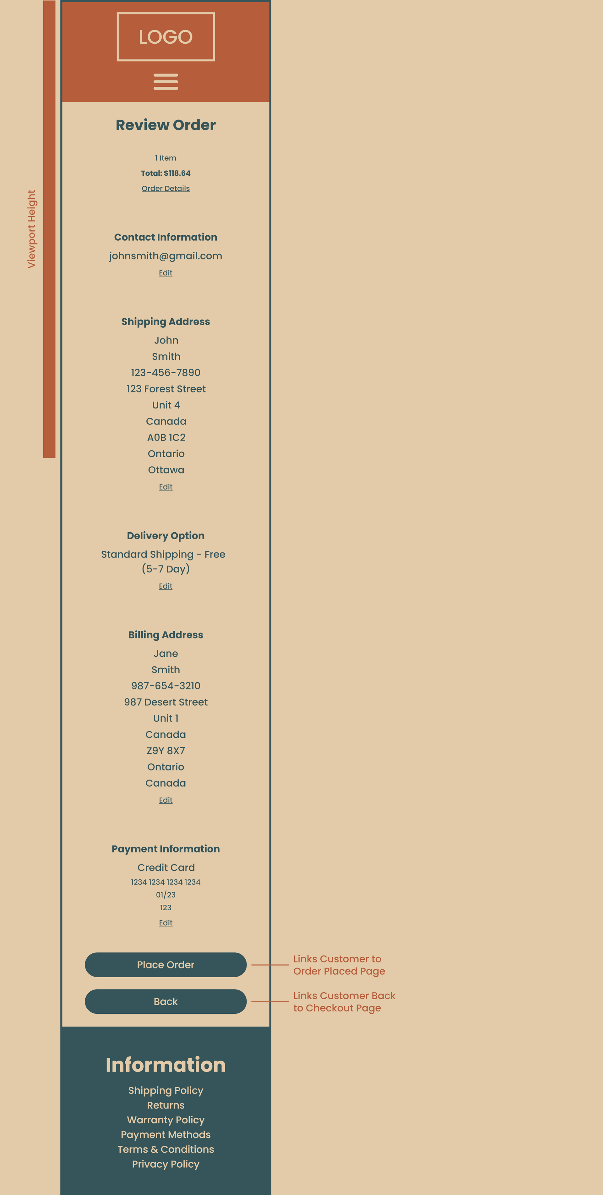
Review Order
This page provides a last minute overview for the customer before they submit their order.
The text boxes from the previous page have been removed in order to display the contact information, shipping address, delivery options, billing address and payment information as clearly as possible. In the event that the customer needs to correct any of the preceding information, there are five clickable “Edit” text buttons so the corresponding data can be changed and updated before placing the order. When an “Edit” text button is clicked, all the text boxes for that section will reappear for the customer to update their information. They can click the “Save Changes” button when they’re finished making edits to a section.
The collapsible “Order Details” content sections at the top of the page also displays all the relevant cart information as seen on the previous page including the customer note (if they choose to leave one).
Customers can also click the “Back” button to return to the previous page to make changes in the event that they don’t see the clickable “Edit” text buttons.
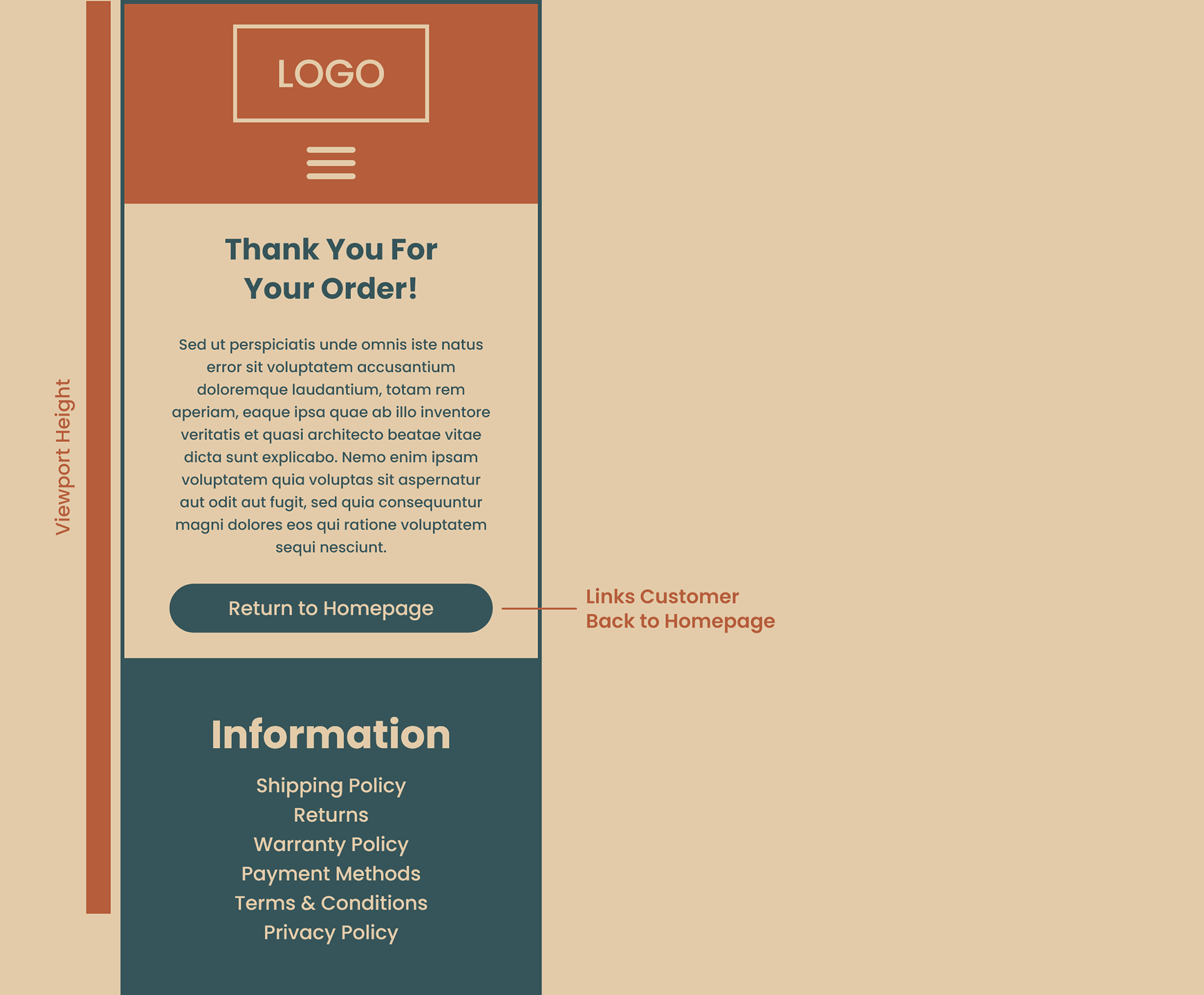
Order Confirmation
The final page a customer should see when making an online purchase should be in the form of a confirmation page that informs them that their order has been placed successfully.
As seen on this page, the text “Thank You For Your Order” followed by a Lorem Ipsum paragraph serves as confirmation for a successful order.
From here, the customer can either leave the site completely or return to the homepage to start the process over by clicking the button labeled “Return to Homepage”.